
Princess Kate’s Head-Turning Pumpkin Orange Look Proves Bold Monochrome Can Look High-Fashion

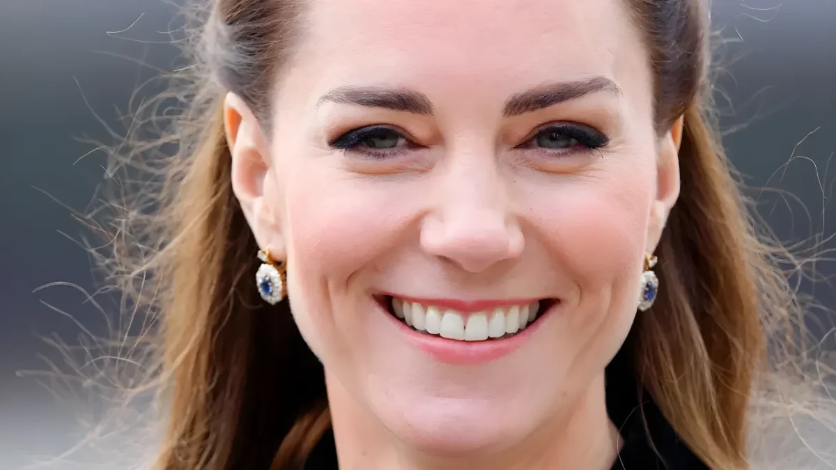
Princess Kate proved that saturated colors can look effortlessly regal when she stepped out in a vibrant, head-to-toe pumpkin orange ensemble. By pairing a matching turtleneck knit with a coordinated pleated skirt from designer Gabriela Hearst, she pulled off an intentional monochrome silhouette that instantly captured international fashion headlines.
The look served as an immediate lesson in high-end styling, proving that bright seasonal tones do not have to feel gimmicky or costumey. Yet behind this standout appearance lies an intriguing styling choice: vivid orange remains one of the rarest shades to ever appear in her royal rotation.
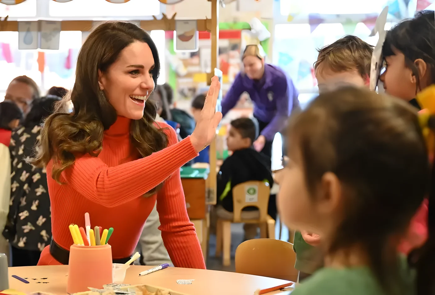
The Princess of Wales waving at children at nursery
The Anatomy of Kate’s Gabriela Hearst Co-Ord
During an appearance at Foxcubs Nursery in Luton to highlight the vital importance of early childhood development, the royal stepped away from her typical navy and burgundy outerwear. Instead, she commanded the room in a fiery knitted set that gave the visual impression of a continuous, fluid jumper dress.
Rather than wearing a single structured dress, opting for a two-piece knit set delivers structural ease and lasting versatility. High-end knitwear provides warmth and texture while allowing the separates to be remixed into dozens of everyday silhouettes.
Gabriela Hearst has long been a favorite luxury label for modern royalty, frequently spotted on both Princess Eugenie and Meghan Markle. To prevent the vibrant hue from overwhelming her frame, the Princess of Wales anchored the palette with heavy, classic contrast.

The Princess of Wales in nursery room with staff and children in orange outfit
She cinched her waist with a substantial black leather belt by Ralph Lauren and finished the styling with matching black boots. The dark leather accents broke up the saturation, creating an architectural line that kept the overall profile sharp and balanced.
| Style Component | Royal Specification |
|---|---|
| Knitted Co-Ord Set | Gabriela Hearst turtleneck sweater and matching skirt |
| Waist Definition | Chunky black leather belt by Ralph Lauren |
| Footwear Choice | Classic black boots |
| Styling Silhouette | Two-piece illusion mimicking a unified jumper dress |
Why the Royal Wardrobe Rarely Features Bright Orange
While the bold ensemble won widespread praise, saturated citrus tones remain an anomaly across royal engagements. The explanation comes down to personal coloring and facial harmony rather than royal etiquette.
Personal color analyst Gabriella Winters of Chromology UK analyzed why this particular hue appears so infrequently on the royal schedule.
“I think the answer lies in DNA and Kate’s awareness of how certain colours [are] less flattering compared to other colours.”
Skin undertones dictate how fabric reflects ambient light against your face. Wearing harmonious hues enhances your complexion, while misaligned tones can cause skin to look washed out.
“People absorb and reflect the same colours differently depending on their unique biological makeup. When a colour is placed adjacent to your face, it will reflect its wavelength onto you. Notably, wearing certain colours can make you appear healthier, with more radiant-looking skin, and those that complement the colour of your eyes or hair can make them ‘pop’ even more.”
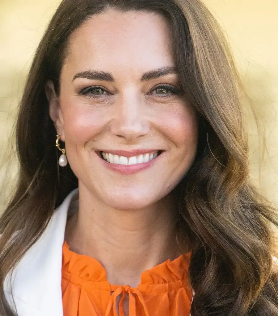
Kate Middleton, the Princess of Wales wears pearl earrings and a white blazer with orange blouse
Debunking the ‘Unwearable Brights’ Myth
A common fashion myth suggests that intensely bright tones like pumpkin orange only work for costumed events or editorial runways. Many shoppers avoid high-saturation warm shades entirely out of fear that the garment will dominate the person wearing it.
The Princess Kate orange outfit proved that execution determines whether a bold shade looks dramatic or sophisticated. You do not need an entire wardrobe redesign to pull off high-voltage tones effectively:
- Break up the line with dark neutrals: High-contrast accessories like thick leather belts cut the visual intensity in half.
- Choose tactile textures over flat cotton: Ribbed knits and wool soften bright pigments by catching shadows in the weave.
- Isolate the tone: If orange clashes with your skin undertone, layer it under a neutral blazer or wear it on the lower half of your body.
✨ Mastering vibrant colors is all about balance, contrast, and understanding what flatters your natural features.
📱 A well-tailored silhouette can instantly transform even the boldest shades into an iconic, timeless statement.
👇 Drop your thoughts in the comments below: Would you wear head-to-toe pumpkin orange, or do you prefer sticking to standard autumn neutrals?
 1
 2
 3
 4
